Ice Mountain
Ice Mountain
Ice Mountain
Agency : JKR Singapore
Challenge
Challenge
“Quench your thirst with the crisp taste of
F&N Ice Mountain. Restore and hydrate your
body's natural balance through constant replenishment.….”
Ice Mountain is one of the largest mineral & sparkling water brands in Asia.
With their new launch of flavoured water, they were open to explore new structures to launch the new flavours.
With Very tight timelines, an array of structures and brand labels were explored.
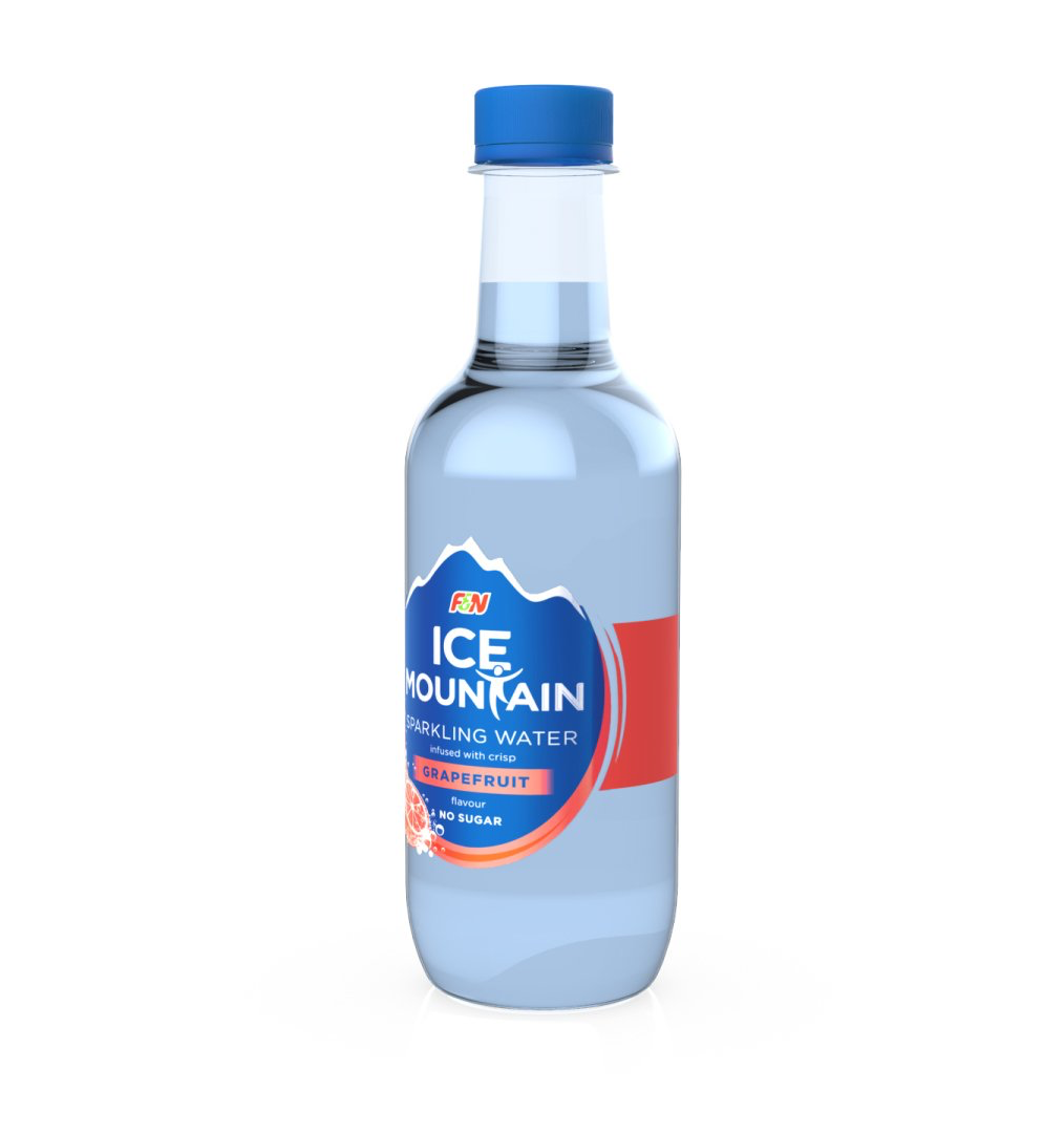
Transparency of labels was a key criteria in the concept and we wanted to retain the existing brand equity of the blue bottle which created immediate shelf differentiation in a markets dominated by transparent green and clear transparent packaging structures.
A fundamental part of the redesign was not only aesthetic but technical. The new structure needed to run down current lines with at least 2 touch points) but a big factor for the change in structure was due to vending issues.
Vending is a big part of Ice mountain’s distribution channel in Asia, however the previous structure was problematic and incompatible with the vending machines. The structure itself was not balanced and too bottom heavy which meant that the product was getting stuck or 2 would be vended by accident.
The new structure needed to be harmoniously balanced with a shift in the centre of gravity. There needed to be an even weighting physically in volume to prevent vending issues.
Value
The design went through many iterations of developmental prototypes to evaluate at key stages.
It was important to not only retain some of the brand equity of the previous bottle but also communicate that this variant was a sparkling variant.
Different in mould textures and frosted labels, however in the end die to client intern were explore. Teh client Soon realised that due to budget and time limitations they may not have the feasibility of a bespoke structure.
This soon evolved into sourcing for a simple stock bottle that allowed for vending that was simple enough to be a blank canvas for brand communication.
A variety of stock bottles were sourced, which satisfied the technical criteria of vending. The structure was so simple that the only way to retain any brand identity was to leverage the colour blue that has been intrinsically linked to the brand.
The rest of the brand communication was done via a transparent PSL label.
This has now been launched, and is available nationwide.


